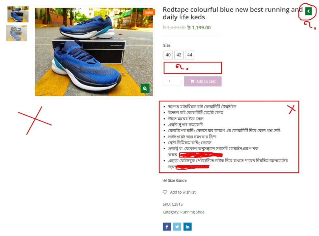
1. The Oversized Imagery Website :

In 2014, a high-end fashion retailer decided to revamp their website. They chose a visually impressive layout with large images and minimal text, to reflect the aesthetic of their brand. However, the images took up a significant portion of the page, leaving little room for product descriptions and customer reviews. As a result, the website was visually pleasing but functionally ineffective. It lacked crucial information that could help customers make informed purchasing decisions, leading to a decrease in conversions and customer satisfaction.
2. The Minimalistic Blog :
A travel blogger in 2016 was inspired by the minimalist website design trend. They redesigned their blog to be sleek and sparse, with wide white spaces and small font sizes. However, their readers found the new layout difficult to navigate. The small text made the blog posts hard to read, and the lack of categorization made it hard for readers to find posts on specific destinations. Despite the visually appealing design, the blog’s readership dropped significantly because the content was not easily accessible.
3. The Complex Navigation Website :
In 2018, a tech start-up launched a website with a unique, complex navigational structure to stand out in the market. The layout was intriguing but not intuitive, with content hidden behind several layers of navigation. This layout confused and frustrated users, causing high bounce rates and low engagement despite the innovative content and services offered by the start-up.
In all these cases, the common thread is that the layout was chosen without considering the content, resulting in a disconnect between the website’s form and function. It underlines the importance of aligning website design with the content it will house to ensure a user-friendly experience that enhances the content’s effectiveness.